

 By rssfeeds-admin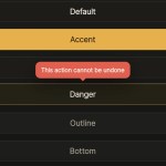
A pure CSS tooltip library that creates Material-style bubble tooltips with
::before, ::after, and HTML data attributes.Features
- Renders tooltip text from the
data-tipattribute value using the CSSattr()function on the::beforepseudo-element. - 4 placement directions: top (default), bottom, left, and right.
- 4 color variants: default, accent, info, and danger.
- Activates on both mouse hover and keyboard focus states for full accessibility.
- Applies a short fade-and-slide transition on tooltip entry and exit.
- Supports standard block buttons, icon buttons, and inline text spans with multi-line layout.
How to use it:
1. Attach data-tip to any element. The attribute value becomes the visible tooltip text.
<!-- Default tooltip — appears above the element -->
<button class="btn" data-tip="Save your changes">Save</button>
2. The data-pos attribute sets which side the tooltip appears on. Defaults to the top position.
<!-- Tooltip appears below the element -->
<button class="btn" data-tip="Revert to the last saved version" data-pos="bottom">Revert</button>

<!-- Tooltip appears to the left -->
<button class="btn" data-tip="Return to previous step" data-pos="left">Back</button>

<!-- Tooltip appears to the right -->
<button class="btn" data-tip="Open live preview" data-pos="right">Preview</button>
3. The data-variant attribute switches the tooltip’s color scheme.
<!-- Accent: yellow background with dark text -->
<button class="btn" data-tip="Recommended next action" data-variant="accent">Publish</button>

<!-- Danger: red background with white text -->
<button class="btn" data-tip="This action cannot be undone" data-variant="danger">Delete</button>

<!-- Info: blue background with white text -->
<button class="btn" data-tip="View the full documentation" data-variant="info">Help</button>
4. Copy this CSS into your stylesheet. The bubble comes from ::before. The arrow comes from ::after.
/* Shared sizing rule for tooltip elements and pseudo-elements. */
*, *::before, *::after {
  box-sizing: border-box;
}

/* Theme tokens control the tooltip surface, text, border, and radius. */
:root {
  --tip-bg: #1e1e1e;
  --tip-text: #f0f0f0;
  --tip-border: #333;
  --tip-accent: #e8ff47;
  --tip-danger: #ff4444;
  --tip-info: #2563eb;
  --tip-radius: 15px;
}

/* Every element with tooltip text becomes the positioning context. */
[data-tip] {
  --tip-active-bg: var(--tip-bg);
  --tip-active-text: var(--tip-text);
  --tip-active-border: var(--tip-border);
  position: relative;
  display: inline-flex;
  align-items: center;
  justify-content: center;
  cursor: default;
}

/* The bubble reads its text from the HTML attribute. */
[data-tip]::before {
  content: attr(data-tip);
  position: absolute;
  z-index: 10;
  background: var(--tip-active-bg);
  color: var(--tip-active-text);
  border: 1px solid var(--tip-active-border);
  border-radius: var(--tip-radius);
  padding: 6px 12px;
  font-family: "DM Mono", monospace;
  font-size: 0.72rem;
  font-weight: 400;
  line-height: 1.4;
  white-space: nowrap;
  pointer-events: none;
  opacity: 0;
  box-shadow: 0 8px 24px rgba(0, 0, 0, 0.5);
  transition: opacity 0.18s ease, transform 0.18s ease;
}

/* The arrow starts as a zero-size triangle. */
[data-tip]::after {
  content: "";
  position: absolute;
  z-index: 11;
  width: 0;
  height: 0;
  pointer-events: none;
  opacity: 0;
  transition: opacity 0.18s ease, transform 0.18s ease;
}

/* Hover and keyboard focus reveal both pseudo-elements. */
[data-tip]:hover::before,
[data-tip]:focus::before,
[data-tip]:hover::after,
[data-tip]:focus::after {
  opacity: 1;
}

/* Keep the browser focus ring under your own UI control. */
[data-tip]:focus {
  outline: none;
}

/* Top placement acts as the default placement. */
[data-tip]:not([data-pos])::before,
[data-tip][data-pos="top"]::before {
  bottom: calc(100% + 10px);
  left: 50%;
  transform: translateX(-50%) translateY(4px);
}

[data-tip]:not([data-pos])::after,
[data-tip][data-pos="top"]::after {
  bottom: calc(100% + 4px);
  left: 50%;
  transform:translateX(-50%) translateY(4px);
  border-left: 6px solid transparent;
  border-right: 6px solid transparent;
  border-top: 6px solid var(--tip-active-border);
}

[data-tip]:not([data-pos]):hover::before,
[data-tip]:not([data-pos]):focus::before,
[data-tip]:not([data-pos]):hover::after,
[data-tip]:not([data-pos]):focus::after,
[data-tip][data-pos="top"]:hover::before,
[data-tip][data-pos="top"]:focus::before,
[data-tip][data-pos="top"]:hover::after,
[data-tip][data-pos="top"]:focus::after {
  transform: translateX(-50%) translateY(0);
}

/* Bottom placement moves the bubble under the target. */
[data-tip][data-pos="bottom"]::before {
  top: calc(100% + 10px);
  left: 50%;
  transform: translateX(-50%) translateY(-4px);
}

[data-tip][data-pos="bottom"]::after {
  top: calc(100% + 4px);
  left: 50%;
  transform: translateX(-50%) translateY(-4px);
  border-left: 6px solid transparent;
  border-right: 6px solid transparent;
  border-bottom: 6px solid var(--tip-active-border);
}

[data-tip][data-pos="bottom"]:hover::before,
[data-tip][data-pos="bottom"]:focus::before,
[data-tip][data-pos="bottom"]:hover::after,
[data-tip][data-pos="bottom"]:focus::after {
  transform: translateX(-50%) translateY(0);
}

/* Left placement moves the bubble before the target. */
[data-tip][data-pos="left"]::before {
  right: calc(100% + 10px);
  top: 50%;
  transform: translateY(-50%) translateX(4px);
}

[data-tip][data-pos="left"]::after {
  right: calc(100% + 4px);
  top: 50%;
  transform: translateY(-50%) translateX(4px);
  border-top: 6px solid transparent;
  border-bottom: 6px solid transparent;
  border-left: 6px solid var(--tip-active-border);
}

[data-tip][data-pos="left"]:hover::before,
[data-tip][data-pos="left"]:focus::before,
[data-tip][data-pos="left"]:hover::after,
[data-tip][data-pos="left"]:focus::after {
  transform: translateY(-50%) translateX(0);
}

/* Right placement moves the bubble after the target. */
[data-tip][data-pos="right"]::before {
  left: calc(100% + 10px);
  top: 50%;
  transform: translateY(-50%) translateX(-4px);
}

[data-tip][data-pos="right"]::after {
  left: calc(100% + 4px);
  top: 50%;
  transform: translateY(-50%) translateX(-4px);
  border-top: 6px solid transparent;
  border-bottom: 6px solid transparent;
  border-right: 6px solid var(--tip-active-border);
}

[data-tip][data-pos="right"]:hover::before,
[data-tip][data-pos="right"]:focus::before,
[data-tip][data-pos="right"]:hover::after,
[data-tip][data-pos="right"]:focus::after {
  transform: translateY(-50%) translateX(0);
}

/* Accent variant for positive or highlighted actions. */
[data-tip][data-variant="accent"] {
  --tip-active-bg: var(--tip-accent);
  --tip-active-text: #0d0d0d;
  --tip-active-border: var(--tip-accent);
}

/* Danger variant for destructive actions. */
[data-tip][data-variant="danger"] {
  --tip-active-bg: var(--tip-danger);
  --tip-active-text: #fff;
  --tip-active-border: var(--tip-danger);
}

/* Info variant for neutral help text. */
[data-tip][data-variant="info"] {
  --tip-active-bg: var(--tip-info);
  --tip-active-text: #fff;
  --tip-active-border: var(--tip-info);
}
Alternatives
The post Material Design Inspired Bubble Tooltips with Pure CSS appeared first on CSS Script.
Discover more from RSS Feeds Cloud
Subscribe to get the latest posts sent to your email.